CLIENT
Crunchtime
YEAR
2023 - Present
ROLE
Brand Strategist & Designer
February 2024 - Crunchtime Expands Global Operations & Surpasses $100M in ARR
Crunchtime — Brand & Website System
The Challenge
After acquiring multiple companies, Crunchtime faced a fragmented brand identity that no longer reflected its expanded mission or customer base (e.g., Taco Bell, Chipotle, Jersey Mike’s, franchise leaders). The legacy brand—25+ years old—felt outdated, inconsistent, and inefficient to maintain across internal teams and external partners.
Key needs:
A cohesive, updated visual system
Scalable assets and templates usable across web, sales, marketing, and internal tools
A site redesign that elevated messaging and conversion for enterprise buyers
My Role & Collaboration
As the designer embedded in the marketing team, I worked directly with the Creative Director, VP of Marketing, Product Marketing, and an external agency to:
Define brand goals based on market positioning and acquisition strategy
Manage design integration across 3+ acquired platforms
Serve as brand “translator,” ensuring clarity and consistency across all touchpoints
Deliverables included:
A redesigned, modular logo and wordmark system (via Famous Folks)
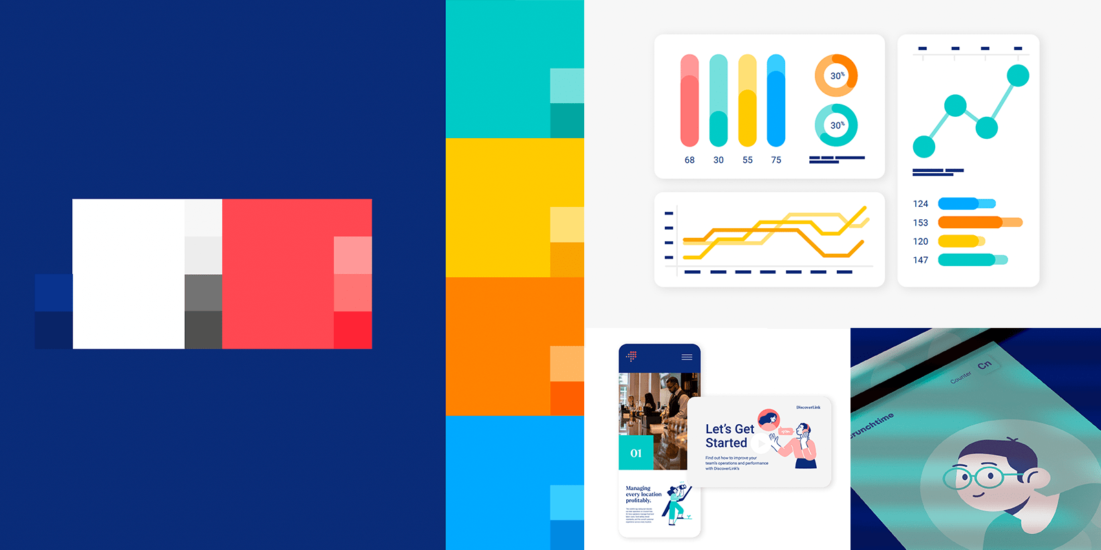
Color and typography guidelines that balanced modernity with professionalism (via Famous Folks)
Spot illustration style and icon system for enhanced visual storytelling
UX-first website wireframes and designs, optimized for enterprise lead capture
Template systems for case studies, decks, explainer videos, social, email, infographics, and sales assets
Motion and interaction direction, including demo animations
Strategic Approach
Systemization, not refresh: Rather than a quick re-skin, I helped build a brand ecosystem—modular, reusable, and intelligent.
User-centered structure: Site and asset templates were designed around enterprise buyer journeys—clear CTAs, client stories, product details.
Cross-team enablement: Co-created tools and templates with marketing, product, and sales to ensure adoption across internal teams.
Lean rollout: Prioritized foundational brand assets first, then built outward—moving fast without losing consistency.
Impact & Business Outcomes
Brand coherence across 100+ assets and channels
A new website structure optimized for demo requests, enterprise lead nurture, and up-sell clarity
Marketing and product teams now use consistent templates—cutting design handoffs by ~40%
Sales teams report greater confidence and alignment when presenting to prospects
The brand system now serves as the foundation for future acquisitions, product launches, and marketing campaigns
Collaborated with Product Marketing to design social promo and email graphics for feature launch
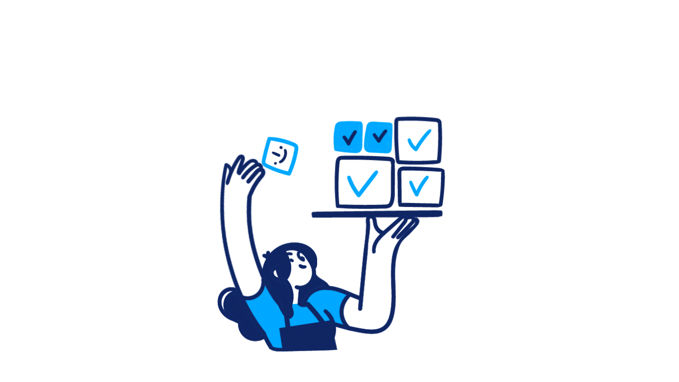
Left: I designed and art directed the motion design for the “Training Complete” animation, which pops up when a customer completes a training module.

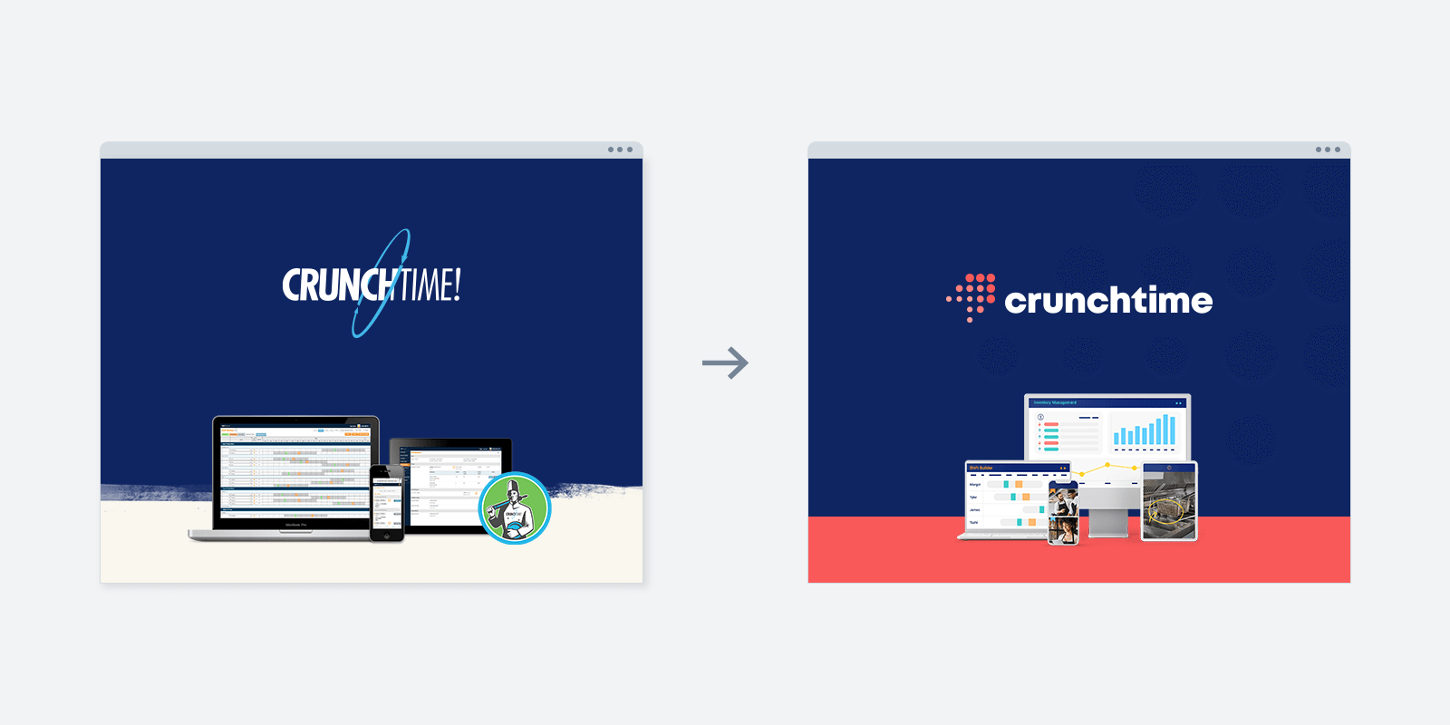
Before: Crunchtime’s branding lacked cohesion and was at risk of hindering growth and reputation in the market.

After: Crunchtime's identity feels fresh, modern, but also timeless. The arrow symbolizes the sustainable location growth customers experience when using Crunchtime. The branding colors are unique from competitors. (Logo & branding designed by Famous Folks)
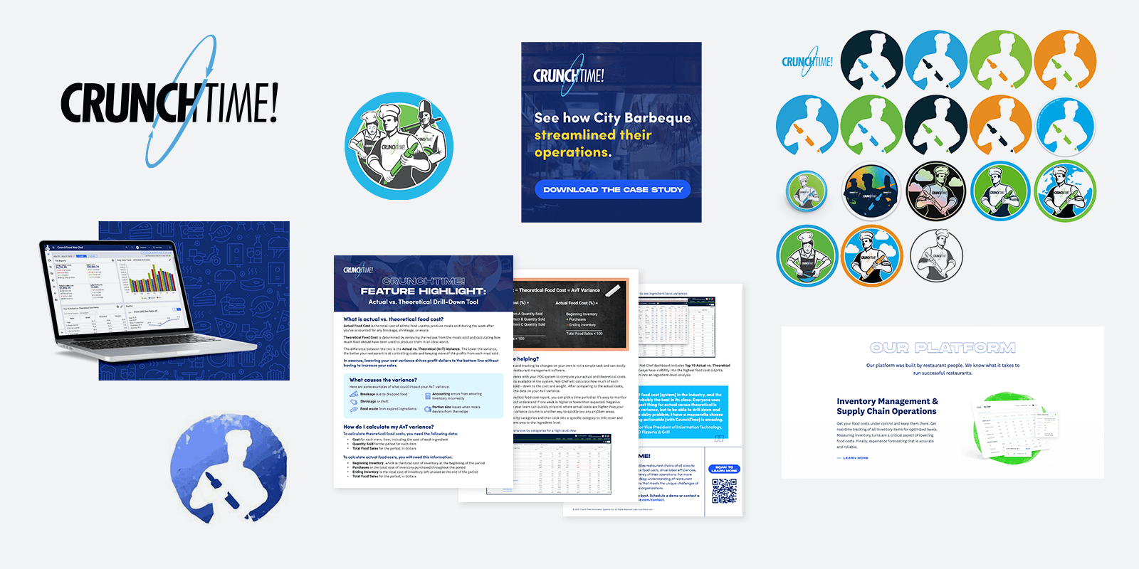
Crunchtime branding designed by Famous Folks
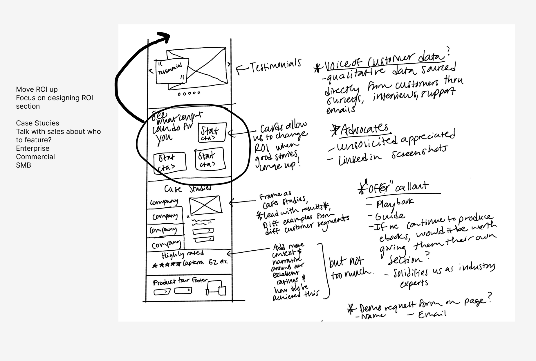
Sketching ideas out before the wireframing stage

Web design: before & afters of the homepage

I implemented the new branding and messaging on a product page
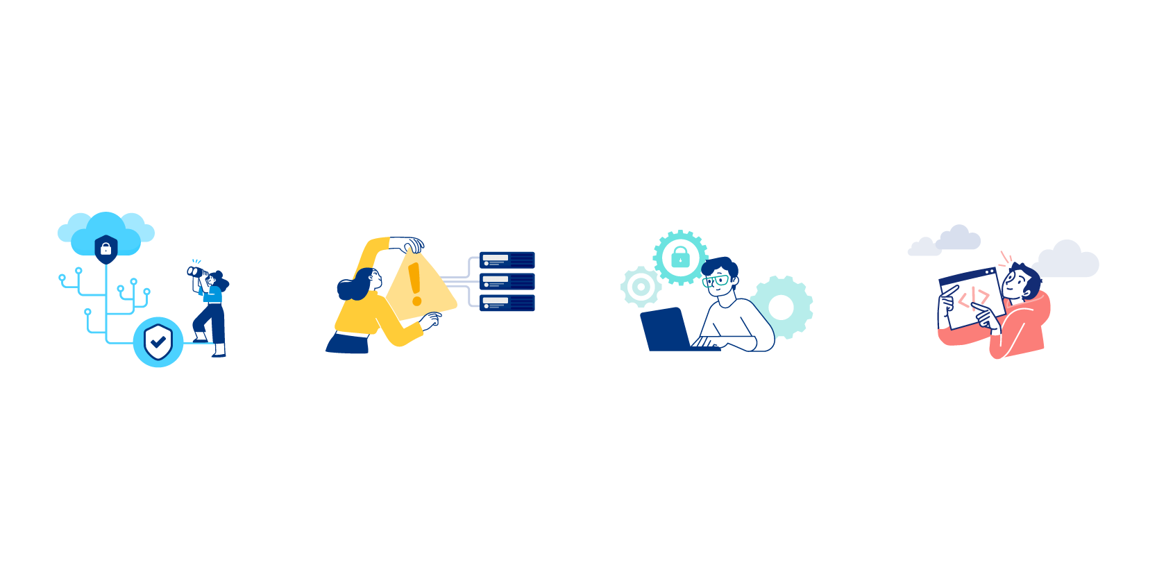
Custom spot illustrations I designed

New case study templates

New sell sheet templates

New web page designs

I collaborated with our product marketing manager to design custom icons for sales to use in their presentations.